


Hundertwasser’s Book Design – A Selection
Catalogues for the World Travelling Museum Exhibition Austria Presents Hundertwasser to the Continents, 1975
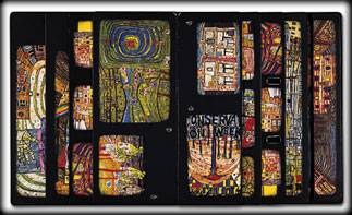
Hundertwasser designed the layout of the catalogues for his world travelling museum exhibition which was shown from 1975 to 1983 in 27 countries and 43 museums on all 4 continents and which was experienced by 4,870,000 visitors. For these catalogues Hundertwasser used for the first time the so-called gradation frames of the pages and the painting reproductions, in order to give each page a different and individual appearance. The catalogue appeared for each country with a different reproduction on the cover, individualised by Hundertwasser with calligraphy of the name of the museum and the year. The first 16 pages contained texts written by the respective museum directors, heads of state and art historians from the various host countries. Its total edition in the three languages German, English and French as from 1976 up to the end of the world travelling museum exhibition tour in 1983 was 450,000 copies.
Exhibition Catalogue: Hundertwasser is painting, 1979
Hundertwasser designed this catalogue on the occasion of a travelling exhibition of his new paintings in five galleries in New York, Tokyo, Hamburg, Oslo and Vienna from 1979 to 1981. In this catalogue, the paintings were reproduced for the first time proportional to their actual size. The width of the pages tapers off like a fan, so that different views of the spreads are created through overlapping when pages are turned.
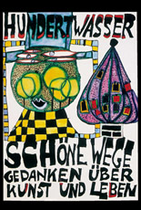
Beautiful Paths – Thoughts on Art and Life, 1983
3 Designs for book covers, 1983
Design I was used for the cover of the book edited by Walter Schurian, Beautiful Paths – Thoughts on Art and Life, in which Hundertwasser’s philosophy was published in a selection of his writings. The book appeared in 1983 at the Deutscher Taschenbuch Verlag (dtv), Munich. A new and completed edition of this text book was published by Langen Müller Verlag, Munich in 2004.
Brockhaus Encyclopedia, 1989
Hundertwasser designed the pattern for the production of the linen for the book covers, as well as the network of lines applied on the encyclopedia’s 24 volumes.
When placing the various volumes next to each other, opened, back-to-back or one above the other, an image always results (…) In weaving the linen for the covers, only natural materials should be used. After a few trials, threads from a special mixture of cotton and linen proved to be best suited to implementing Hundertwasser’s intentions as to structure and colour. Their natural variation in thickness of the linen gives the cover vitality; the black weft thread and the coloured warp threads cause constantly changing colour combinations. (…) A special flock coating with velour gave the lines (on the covers, editor’s note) an embossed effect, like a relief. They connect at the edges of the covers, so that the overall design can be made out. The stamping of the aluminium-based metallic foil was likewise a very complex process: as there were neither tools, stamps nor patterns which measured up to Hundertwasser’s highly expressive design intentions, they had to be specially cast in brass. Only then could the actual production of the inlays begin. All in all, over 50 steps were needed to complete the cover of one volume.
In addition to the design of the cover boards, Hundertwasser designed the title panels on the spines and the image arrangement of the complete set. (…) One letter of the name Brockhaus was highlighted in the sequence of the volumes, so that from a distance the individual letters form the whole name once again.
translated from the brochure: Kunstwerk, Die Hundertwasser-Ausgabe der Brockhaus-Enzyklopädie, n. p. 1989
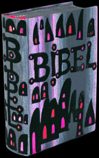
The Bible, 1995
Hundertwasser designed this bible edition over a period of several years. It is illustrated with 82 works, 32 of which are collages that he created specifically for this edition. He influenced the entire production of this bible, including the format and type of paper selected. Following his design, the woven linen cover is different in each copy. Each bible has a different colour combination within the linen weave. In addition, the copies vary in the colours of the metal embossing. Each copy is unlike all others. The covers were mostly produced by hand. In order to guarantee this uniqueness, the most difficult bookbinding challenges were mastered.
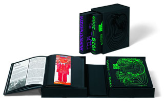
Hundertwasser Catalogue Raisonné, 1997-2002
Cover and book design: Friedensreich Hundertwasser
Text Vol. I: Wieland Schmied, Munich
Catalogue Raisonné, Vol. II: Andrea Christa Fürst, Vienna
Hundertwasser designed the layout of the book as well as its decor and cover. Each page received Hundertwasser's individual design for the type area and follows his ideas concerning size and placement of the illustrations. In addition, Hundertwasser chose five of his doodle drawings for the design of the slipcase and the separate volumes. Another five doodles by Hundertwasser were rendered into colour etchings with an edition of 2,000 each. One of these prints is contained in every copy of the catalogue raisonné. What has resulted is a bibliophile publication reflecting Hundertwasser's work and life exactly as he intended. Before his departure from New Zealand in February 2000, Hundertwasser wrote comments for selected works in his œuvre.